
flex を初めて触ったのは去年でした。当時、初めてモバイルプロジェクトを担当したのですが、互換性の問題で苦労しました。Can I Use で調べたところ、Android 4.1までしかサポートされていないことが分かりました。しかし、私たちの要件は4.0まで互換性を持たせることでした。 そのため、それ以来ずっと使うのをためらっていました。昨日、flex は Android 2.1以降をサポートしていると聞きました。信じられませんでした。まさか、あの時見間違えていたのでしょうか?! 今日もう一度調べてみたところ、やはり4.1でした。画面をじっと見つめながらしばらく考えた後、Can I Use にあるブラウザの使用率にふと気づきました。もしかして、使用率の低いブラウザは無視されているのではないかと思いました。設定を開いてみると、案の定その通りでした。そこでデータソースを中国に変更し、ブラウザの最小使用率を0.03%に設定したところ、本当に2.3が表示されました。

こうなると、flex はやはり本番環境でも使用できるということになります。それでは、その使い方を改めて確認してみましょう。 Flex は「フレキシブルボックスレイアウト」のことで、どの要素でも flex レイアウトに設定できます。要素が flex レイアウトに設定されると、その子要素の float や vertical-align は無効になります。
div {
  display: flex;
}
基本概念
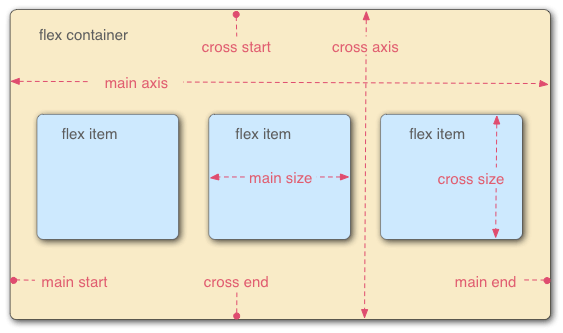
つまり、flex コンテナには2つの軸があります。主軸と交差軸です。各軸にはそれぞれ対応する開始位置があり、主軸の開始位置は main start と main end、交差軸の開始位置は cross start と cross end です。 コンテナ内のアイテムは、デフォルトで主軸に沿って、main start から main end へと並べられます。
flex コンテナ
コンテナには以下の6つのプロパティを設定できます。
- flex-direction
- flex-wrap
- flex-flow
- justify-content
- align-items
- align-content
flex-direction
主軸の方向、つまりアイテムの並び順を決定します。
MDNでの構文解説:
/* The direction text is laid out in a line */
flex-direction: row;
/* Like <row>, but reversed */
flex-direction: row-reverse;
/* The direction in which lines of text are stacked */
flex-direction: column;
/* Like <column>, but reversed */
flex-direction: column-reverse;
/* Global values */
flex-direction: inherit;
flex-direction: initial;
flex-direction: unset;
例
以下は左から順に row、row-reverse、column、column-reverse です。それぞれの違いが明確にわかります。
flex-wrap
flex-wrap は、内部のアイテムを1行に並べるか、またはオーバーフローしたときに改行を許可するかを定義するプロパティです。改行が許可されている場合、このプロパティはアイテムの積み重ね方向も制御できます。
構文
flex-wrap: nowrap;
flex-wrap: wrap;
flex-wrap: wrap-reverse;
例:
flex-flow
flex-flow は flex-direction と flex-wrap のショートハンドプロパティです。 初期値:
- flex-directoin: row
- flex-wrap: nowrap
構文:
/* flex-flow: <'flex-direction'> */
flex-flow: row;
flex-flow: row-reverse;
flex-flow: column;
flex-flow: column-reverse;
/* flex-flow: <'flex-wrap'> */
flex-flow: nowrap;
flex-flow: wrap;
flex-flow: wrap-reverse;
/* flex-flow: <'flex-direction'> and <'flex-wrap'> */
flex-flow: row nowrap;
flex-flow: column wrap;
flex-flow: column-reverse wrap-reverse;
justify-content
justify-content は、主軸上 (main-axis) の flex アイテム間のスペースをブラウザがどのように計算するかを定義するために使用されます。 アラインメントのプロセスは、長さと自動マージンの計算後に行われます。つまり、flex-grow が0ではないフレキシブルな要素が1つでもある場合、justify-content は効果を発揮しません。初期値は flex-start です。
構文:
/* Pack flex items from the start */
justify-content: flex-start;
/* Pack items from the end */
justify-content: flex-end;
/* Pack items around the center */
justify-content: center;
/* Distribute items evenly
The first item at the start, the last at the end */
justify-content: space-between;
/* Distribute items evenly
Items have equal space around them */
justify-content: space-around;
例:
align-items
align-items プロパティは、現在の flex line 上の flex 要素を整列させるために使用されます。justify-content と同様ですが、主軸に対して垂直な方向に作用します。初期値は stretch です。
構文
/* Align to cross-start */
align-items: flex-start;
/* Align to cross-end */
align-items: flex-end;
/* Center items in the cross-axis */
align-items: center;
/* Align the items' baselines */
align-items: baseline;
/* Stretch the items to fit */
align-items: stretch;
例
align-content
align-content プロパティは、交差軸にスペースがある場合に、flex 要素が交差軸上でどのように整列するかを定義します。単一行の flex 要素に対しては、このプロパティは効果がありません。デフォルト値は stretch です。
構文
/* Pack lines from the cross-axis start */
align-content: flex-start;
/* Pack lines to the cross-axis end */
align-content: flex-end;
/* Pack lines around the cross-axis center */
align-content: center;
/* Distribute lines along the cross-axis, start to end */
align-content: space-between;
/* Distribute lines along the cross-axis, equally spaced */
align-content: space-around;
/* Stretch lines to occupy the whole cross-axis */
align-content: stretch;
例
flex アイテム(子要素)
flex アイテムにも同様に6つのプロパティを設定できます。
- order
- flex-grow
- flex-shrink
- flex-basis
- align-self
- flex
order
アイテムの主軸上での優先順位を定義します。値が小さいほど前に配置されます。デフォルトは 0 です。
flex-grow
アイテムの伸縮係数を定義します。これは、アイテムが残りのスペースをどのように占めるかを計算するものです。デフォルトは 1 です。
flex-shrink
アイテムの縮小係数を定義します。デフォルトは 1 です。
order, flex-grow, flex-shrink の例
flex-basis
flex-basis は、初期段階で flex が主軸空間を占める基本サイズを定義します。このプロパティは、box-sizing を変更しない限り、content-box のサイズを決定します。初期値は auto です。
構文
/* Specify <'width'> */
flex-basis: 10em;
flex-basis: 3px;
flex-basis: auto;
/* Intrinsic sizing keywords */
flex-basis: fill;
flex-basis: max-content;
flex-basis: min-content;
flex-basis: fit-content;
/* Automatically size based on the flex item’s content */
flex-basis: content;
例
flex
flex は、アイテムのサイズ変更能力を定義するショートハンドプロパティです。 デフォルト値:
- flex-grow: 0
- flex-shrink: 1
- flex-basis: auto
構文
/* 0 0 auto */
flex: none;
/* One value, unitless number: flex-grow */
flex: 2;
/* One value, width/height: flex-basis */
flex: 10em;
flex: 30px;
flex: auto;
flex: content;
/* Two values: flex-grow | flex-basis */
flex: 1 30px;
/* Two values: flex-grow | flex-shrink */
flex: 2 2;
/* Three values: flex-grow | flex-shrink | flex-basis */
flex: 2 2 10%;
align-self
アイテムの整列方法を定義し、align-items プロパティを上書きします。いずれかのアイテムの交差軸方向のマージンが auto に設定されている場合、align-self は無視されます。デフォルト値は auto です。
構文
align-items と同じ
例
この記事は 2016年5月5日 に公開され、2025年10月13日 に最終更新されました。248 日が経過しており、内容が古くなっている可能性があります。