
My first encounter with flex was last year when I was working on my first mobile project, and I ran into compatibility issues. I checked Can I Use and found it only supported Android 4.1, but our requirement was to be compatible with 4.0. So I hadn’t dared to use it since then. Yesterday, I heard someone say that flex could support Android 2.1 and above. I didn’t believe it. Had I misread it back then?! Today, I checked again and indeed, it was 4.1. Staring at the screen for a long time, I suddenly noticed the browser usage rate on Can I Use and wondered if it might be ignoring browsers with low usage. I opened the settings and, sure enough, that was the case. So I changed the data source to China and set the minimum browser usage to 0.03%, and indeed, 2.3 appeared.

Given this, it means flex can still be used in production environments. So, let’s go over its usage properly. Flex, or Flexible Box Layout, allows any element to be set as a flex container. Once an element is set to flex layout, float and vertical-align properties on its child elements become ineffective.
div {
  display: flex;
}
Basic Concepts
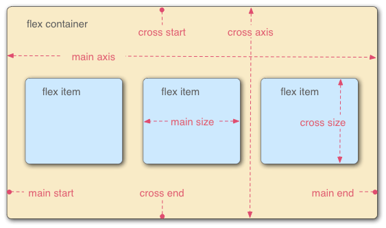
This means a flex container has two axes: a main axis and a cross axis. Each axis has its corresponding start and end positions. The main axis starts at main start and ends at main end, while the cross axis starts at cross start and ends at cross end. Items within the container are arranged along the main axis by default, from main start to main end.
Flex Container
A container can have 6 properties, which are:
- flex-direction
- flex-wrap
- flex-flow
- justify-content
- align-items
- align-content
flex-direction
Determines the direction of the main axis, which is the arrangement direction of the items.
MDN Syntax Explanation:
/* The direction text is laid out in a line */
flex-direction: row;
/* Like <row>, but reversed */
flex-direction: row-reverse;
/* The direction in which lines of text are stacked */
flex-direction: column;
/* Like <column>, but reversed */
flex-direction: column-reverse;
/* Global values */
flex-direction: inherit;
flex-direction: initial;
flex-direction: unset;
Example
Below, from left to right, are row, row-reverse, column, column-reverse. Their differences are clearly visible.
flex-wrap
flex-wrap defines whether flex items are laid out in a single line or allowed to wrap onto multiple lines when they overflow. If wrapping is allowed, this property also lets you control the direction of stacking.
Syntax
flex-wrap: nowrap;
flex-wrap: wrap;
flex-wrap: wrap-reverse;
Example:
flex-flow
flex-flow is a shorthand property for flex-direction and flex-wrap. Initial values:
- flex-direction: row
- flex-wrap: nowrap
Syntax:
/* flex-flow: <'flex-direction'> */
flex-flow: row;
flex-flow: row-reverse;
flex-flow: column;
flex-flow: column-reverse;
/* flex-flow: <'flex-wrap'> */
flex-flow: nowrap;
flex-flow: wrap;
flex-flow: wrap-reverse;
/* flex-flow: <'flex-direction'> and <'flex-wrap'> */
flex-flow: row nowrap;
flex-flow: column wrap;
flex-flow: column-reverse wrap-reverse;
justify-content
justify-content defines how the browser distributes space between flex items along the main axis. The alignment process occurs after lengths and auto margins are calculated. This means if there is at least one flexible item with flex-grow set to a non-zero value, justify-content will have no effect. The initial value is flex-start.
Syntax:
/* Pack flex items from the start */
justify-content: flex-start;
/* Pack items from the end */
justify-content: flex-end;
/* Pack items around the center */
justify-content: center;
/* Distribute items evenly
The first item at the start, the last at the end */
justify-content: space-between;
/* Distribute items evenly
Items have equal space around them */
justify-content: space-around;
Example:
align-items
The align-items property is used to align flex items along the current flex line, similar to justify-content, but it acts in the perpendicular direction to the main axis. The initial value is stretch.
Syntax
/* Align to cross-start */
align-items: flex-start;
/* Align to cross-end */
align-items: flex-end;
/* Center items in the cross-axis */
align-items: center;
/* Align the items' baselines */
align-items: baseline;
/* Stretch the items to fit */
align-items: stretch;
Example
align-content
The align-content property defines how flex lines are aligned along the cross axis when there is extra space in the flex container. For single-line flex containers, this property has no effect. The default value is stretch.
Syntax
/* Pack lines from the cross-axis start */
align-content: flex-start;
/* Pack lines to the cross-axis end */
align-content: flex-end;
/* Pack lines around the cross-axis center */
align-content: center;
/* Distribute lines along the cross-axis, start to end */
align-content: space-between;
/* Distribute lines along the cross-axis, equally spaced */
align-content: space-around;
/* Stretch lines to occupy the whole cross-axis */
align-content: stretch;
Example
Flex Items (Children)
Flex items can also have 6 properties set on them:
- order
- flex-grow
- flex-shrink
- flex-basis
- align-self
- flex
order
Defines the priority of items along the main axis; smaller values appear earlier. The default is 0.
flex-grow
Defines the flex grow factor of an item, which determines how much it will grow relative to the rest of the flex items to fill the available space. The default is 1.
flex-shrink
Defines the flex shrink factor of an item. The default is 1.
order, flex-grow, flex-shrink Example
flex-basis
flex-basis defines the initial main size of a flex item before any available space is distributed. This property determines the size of the content box, unless you modify box-sizing. The initial value is auto.
Syntax
/* Specify <'width'> */
flex-basis: 10em;
flex-basis: 3px;
flex-basis: auto;
/* Intrinsic sizing keywords */
flex-basis: fill;
flex-basis: max-content;
flex-basis: min-content;
flex-basis: fit-content;
/* Automatically size based on the flex item’s content */
flex-basis: content;
Example
flex
flex is a shorthand property that defines the ability of a flex item to grow, shrink, or specify its initial size. Default values:
- flex-grow: 0
- flex-shrink: 1
- flex-basis: auto
Syntax
/* 0 0 auto */
flex: none;
/* One value, unitless number: flex-grow */
flex: 2;
/* One value, width/height: flex-basis */
flex: 10em;
flex: 30px;
flex: auto;
flex: content;
/* Two values: flex-grow | flex-basis */
flex: 1 30px;
/* Two values: flex-grow | flex-shrink */
flex: 2 2;
/* Three values: flex-grow | flex-shrink | flex-basis */
flex: 2 2 10%;
align-self
Defines the alignment for the current flex item, overriding the align-items property set on the container. If a flex item’s cross-axis margin is set to auto, align-self will be ignored. The default value is auto.
Syntax
Same as align-items
Example
This article was published on May 5, 2016 and last updated on October 13, 2025, 248 days ago. The content may be outdated.