
Recently, a mobile project at my company required an animation. The animation depicts a person running on a track. To achieve better performance on mobile devices, we opted to implement the entire animation using CSS3. As this was my first time tackling such a task, I encountered numerous issues, which I’ve documented here.
Here’s what the final animation looks like: 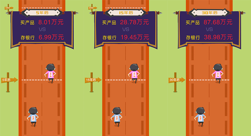
Analysis
Upon receiving the design, I first analyzed it. The animation can be broken down into four main parts:
- The running person
- The moving road
- The left road signs
- The income signs
The Runner
The runner was straightforward to implement. By using a sprite sheet of a person running, 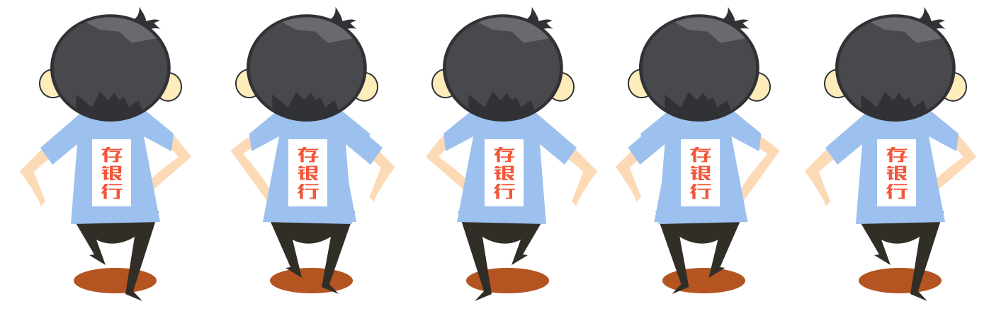 and then changing its
 background-position frame by frame, it was quite simple.
.person {
    width: 62px;
    height: 110px;
    background: url(../imgs/plan/person1.png) -7px 0 no-repeat;
    background-size: auto 110px;
    animation: run .5s infinite;			// Remember to add vendor prefixes for various browsers, especially -webkit-. I'll omit them here for brevity.
    position: absolute;
    top: 40%;
    left: 110*.84px;
}
@keyframes run {
    0% {
        background-position: -7px 0
    }
    25% {
        background-position: -79px 0
    }
    50% {
        background-position: -150px 0
    }
    75% {
        background-position: -216px 0
    }
    100% {
        background-position: -283px 0
    }
}
However, the runner initially looked like this:  It was terrible. Upon analyzing the cause, I realized that
 keyframes have a default transition. This meant my background-position was linearly interpolating from -7 to -283, which was certainly not the desired outcome. I suspected this was an issue with the animation timing function, so I looked up the possible values for animation-timing-function:
linear: Linear transition. Equivalent to Bezier curve (0.0, 0.0, 1.0, 1.0) ease: Smooth transition. Equivalent to Bezier curve (0.25, 0.1, 0.25, 1.0) ease-in: Starts slow, then speeds up. Equivalent to Bezier curve (0.42, 0, 1.0, 1.0) ease-out: Starts fast, then slows down. Equivalent to Bezier curve (0, 0, 0.58, 1.0) ease-in-out: Starts slow, speeds up, then slows down. Equivalent to Bezier curve (0.42, 0, 0.58, 1.0) step-start: Equivalent to
steps(1, start)step-end: Equivalent tosteps(1, end)steps([, [ start | end ] ]?): A stepping function that accepts two parameters. The first parameter must be a positive integer, specifying the number of steps in the function. The second parameter can bestartorend, specifying the point in time when each step’s value changes. The second parameter is optional and defaults toend. cubic-bezier(, , , ): A specific Bezier curve type, where the 4 values must be within the [0, 1] range.
The step property was exactly what we needed, allowing it to jump directly from one state to another instead of transitioning. Adding this property to the .person class above solved the issue:
animation-timing-function: step-start; With that, the runner’s animation was resolved.
The Road
Initially, I couldn’t think of a good approach for the road. My first thought was to cut a large section, create two images, and then alternate their appearance. However, this would result in very large images, consuming network resources and feeling like a clumsy method. After analyzing the track, I came up with a better idea.  By extracting the smallest repeating segment of the track, tiling it vertically, and then moving its
 background-position by half the image’s height each time, the effect could be achieved. 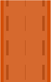 This also solved the road animation.
The Left Road Sign
This was very simple. I just set its absolute position and then changed its top value. It’s important to note that the last sign needed to stop in the middle. Adding this property achieved that:
animation-fill-mode: forwards;The
animation-fill-modeproperty specifies how an animation’s effects are applied before or after it plays. Values none: Does not change the default behavior. forwards: When the animation completes, it retains the computed values of the properties for the last keyframe. backwards: During the period defined byanimation-delay, the starting property values (defined in the first keyframe) are applied before the animation begins. both: Both forwards and backwards fill modes are applied.
The Income Sign
Similar to the left road sign, this was very simple. It merely involved appearing and disappearing.
Combination
After resolving the four parts of the animation, the next step was to combine them. 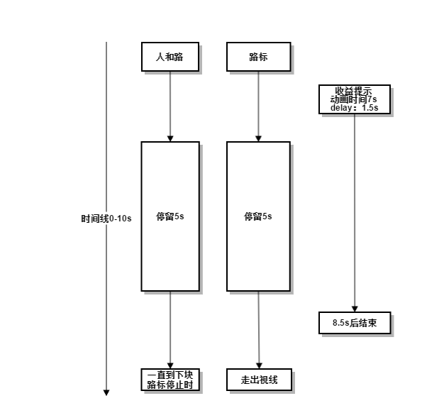 The image above shows the flow chart for the first road sign’s process from appearing on screen to disappearing. For the other two road signs, their processes simply required delaying the animation by the corresponding time intervals. There was also an issue of making the runner and the road stop at a specific point. This didn’t seem achievable with CSS3 alone, so I opted for a fallback: controlling it with JavaScript. By setting its
 webkit-animation-play-state property to paused and running, I could make it stop and then resume movement. Finally, a pop-up needed to appear after the animation completed. This was achieved by detecting the animationEnd event. Here’s the implementation:
/* From Modernizr */
function whichAnimationEvent(){
    var t;
    var el = document.createElement('fakeelement');
    var animations = {
      'animation':'animationend',
      'OAnimation':'oAnimationEnd',
      'MozAnimation':'animationend',
      'WebkitAnimation':'webkitAnimationEnd'
    }

    for(t in animations){
        if( el.style[t] !== undefined ){
            return animations[t];
        }
    }
}

/* Listen for a transition! */
var transitionEvent = whichAnimationEvent();
whichAnimationEvent && e.addEventListener(whichAnimationEvent, function() {
	//doSomething
});

/*
	The "whichTransitionEvent" can be swapped for "animation" instead of "transition" texts, as can the usage :)
*/
Result
Here is the final completed effect. Click here to see the animation