163 words
1 minutes
How to Create a Page Curl Shadow
Methods for creating some special shadows essentially involve stacking multiple shapes together, then adjusting their stacking order with z-index to finally achieve the desired effect. 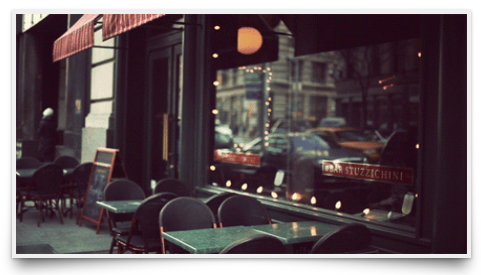
HTML:
<li><img src="img/1.gif" alt="img" /></li>CSS:
li::after {
  content: "";
  width: 90%;
  height: 80%;
  left: 1.6%;
  bottom: 4.6%;
  position: absolute;
  background-color: transparent;
  box-shadow: 0px 8px 20px rgba(0, 0, 0, 0.6);
  -webkit-transform: rotate(-4deg) skew(-8deg);
  -moz-transform: rotate(-4deg) skew(-8deg);
  -ms-transform: rotate(-4deg) skew(-8deg);
  -o-transform: rotate(-4deg) skew(-8deg);
  transform: rotate(-4deg) skew(-8deg);
  z-index: -1;
}
li::before {
  content: "";
  width: 90%;
  height: 80%;
  right: 1.6%;
  bottom: 4.6%;
  position: absolute;
  background-color: transparent;
  box-shadow: 0px 8px 20px rgba(0, 0, 0, 0.6);
  -webkit-transform: rotate(4deg) skew(8deg);
  -moz-transform: rotate(4deg) skew(8deg);
  -ms-transform: rotate(4deg) skew(8deg);
  -o-transform: rotate(4deg) skew(8deg);
  transform: rotate(4deg) skew(8deg);
  z-index: -1;
}
It’s essentially about taking two parallelograms, rotating them left and right respectively, placing them beneath the original image (as shown in the diagram below), and applying a shadow to them, which will ultimately create the shadow effect seen in the image. 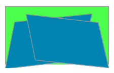 Click here to view the DEMO
How to Create a Page Curl Shadow
https://blog.kisnows.com/en-US/2015/01/26/rase-shadow/