Ghost buttons have been quite popular recently, so I decided to create one. It has the following effects: 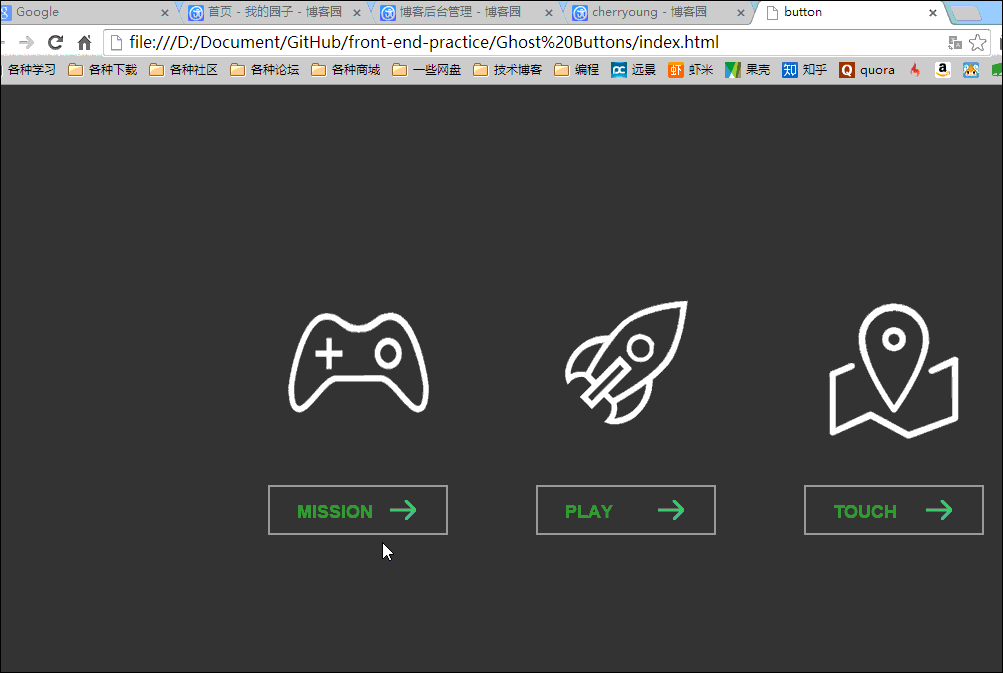
The lines on the button and the rotation of the icon are entirely implemented using CSS3’s transition and transform properties. The icon’s rotation effect is achieved as follows:
.link .img{
    display: block;
    width:180px;
    height:180px;
    margin-bottom: 20px;
    -webkit-transition:all 0.5s cubic-bezier(0, .18, 0, .97);    //为了兼容chrome和Safari
    transition:all 0.5s cubic-bezier(0, .18, 0, .97);        //定义动画属性,包括要变化的属性,时间,以及变化曲线(linear、ease、ease-out或者自定义等)
}
.mis .img{
    background: url(../images/mission.png) no-repeat  center 0;
}
.link .img:hover{
    -webkit-transform: rotate(360deg) scale(1.2);
    -ms-transform: rotate(360deg) scale(1.2);
    transform: rotate(360deg) scale(1.2);

}
The button’s line effect is similar to the method above, while the tooltip text on the button is implemented using JavaScript.
The main principle is to use JavaScript to get the corresponding title (i.e., the text to be displayed) from the button, then add it to the tooltip box, and finally, determine the current button’s position to set the appropriate display position for the tooltip box.
$(function(){
    $(".link .btn").hover(function(){
        var title = $(this).attr("data-title");
        $(".tip em").text(title);
        var left = $(this).position().left;
        var dis = Math.abs(($(".tip").outerWidth()-$(this).outerWidth())/2);
        var now = left -dis;
        console.log("title="+title+"  ","left="+left,"dis=",dis,"now="+now,"this"+$(".tip").outerWidth());
        $(".tip").css({"left":now+"px"}).animate({"top":130,"opacity":1},300);
    },
    function(){
        $(".tip").animate({"top":100,"opacity":0},300);
    }
    )
})
// Uses jQuery's `hover(function(), function())` function, where the first function handles the mouse-over action and the second handles the mouse-leave action.
This article was published on January 1, 2015 and last updated on October 13, 2025, 248 days ago. The content may be outdated.