306 字
2 分钟
前端开发学习笔记五
幽灵按钮最近很流行,就寻思着做了一个,它有如下一些效果。 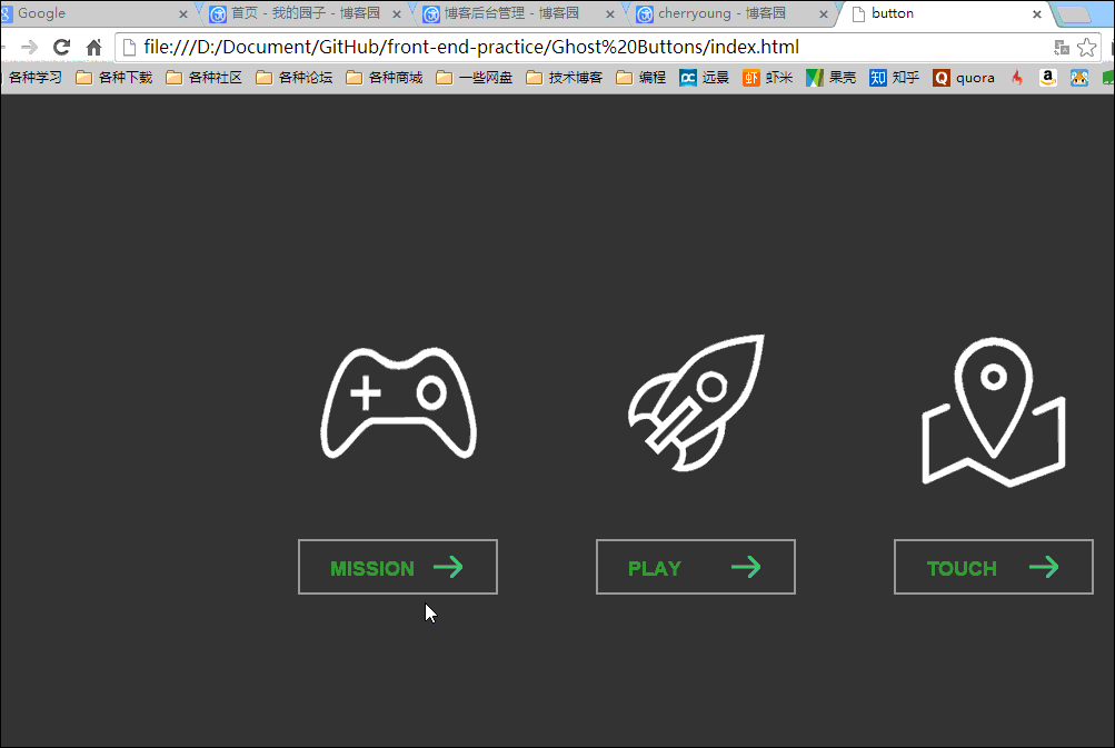
其中按钮上的线条和图标的旋转完全用CSS3中的transtion和transform来实现,其中图标的旋转效果实现过程如下:
.link .img{
    display: block;
    width:180px;
    height:180px;
    margin-bottom: 20px;
    -webkit-transition:all 0.5s cubic-bezier(0, .18, 0, .97);    //为了兼容chrome和Safari
    transition:all 0.5s cubic-bezier(0, .18, 0, .97);        //定义动画属性,包括要变化的属性,时间,以及变化曲线(linear、ease、ease-out或者自定义等)
}
.mis .img{
    background: url(../images/mission.png) no-repeat  center 0;
}
.link .img:hover{
    -webkit-transform: rotate(360deg) scale(1.2);
    -ms-transform: rotate(360deg) scale(1.2);
    transform: rotate(360deg) scale(1.2);

}
按钮的线条效果与上面的方法类似,而按钮上的提示文字使用 js 来实现的。
主要原理就是通过 js 获取按钮上相应的 title(即要显示的文字),然后将其增加在提示框内,在通过判定当前按钮的位置来设置提示框要出现的相应位置。
$(function(){
    $(".link .btn").hover(function(){
        var title = $(this).attr("data-title");
        $(".tip em").text(title);
        var left = $(this).position().left;
        var dis = Math.abs(($(".tip").outerWidth()-$(this).outerWidth())/2);
        var now = left -dis;
        console.log("title="+title+"  ","left="+left,"dis=",dis,"now="+now,"this"+$(".tip").outerWidth());
        $(".tip").css({"left":now+"px"}).animate({"top":130,"opacity":1},300);
    },
    function(){
        $(".tip").animate({"top":100,"opacity":0},300);
    }
    )
})
//用了jQuery框架中的hover(function(),function())函数,前一个函数为鼠标放上去的动作,后一个为鼠标离开时的动作。
本文发布于 2015年1月1日,最后更新于 2015年1月1日,距今已有 4186 天,文章内容可能已经过时。